How to share design system themes between Android & iOS
Because dark mode is on the rise, mobile apps must support themes, however how do we define them?
Dark mode is on the rise. ~82% of users use it as much as possible[1][2]. Odds are, you're amongst them! 🌚
The vast majority of operating systems also support it & expect their applications to do so too. Operating systems include macOS, Windows, iOS, & Android. This means if your application does not support dark mode, it will be frowned upon.
There's a problem with dark mode: it's not easy to implement even with a design system & its colors defined. The reason being dark mode & light mode are in actuality themes:
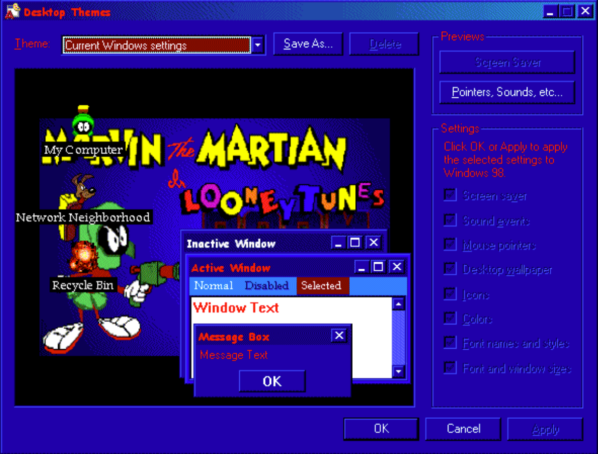
Screenshot of a Windows 98 theme previewer.
Notice the Martian Windows 98 theme preview and its various attributes. Attributes constituting the theme here include: window's inactive/active colors, menu item colors for its various states: normal, disabled, etc. While there is more to a theme like fonts, icons, and sounds, we're primarily focusing today on its dimension of colors.
A point worth noting, a theme is defined at the framework level. A theme for macOS will vary from a theme for Windows. That's because each framework has its own set of semantic colors needing to be defined. Semantic colors are colors that are defined to serve a particular purpose. Once these set of semantic colors are defined however, a framework then applies them to UI components according to its rules at runtime. Here is how Android in the past applied its semantic colors to a blank page:
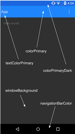
Semantic color placement of Android's theming framework.
What's not apparent from this screenshot is how these semantic colors may be reused elsewhere for different components like say a date picker. To summarize:
A theme's colors are a set of semantic colors systematically placed on UI components per its framework's rules.
Now let's go to where an application's theme design beings, namely at the designer's desk when creating a design system. In today's average design system you'll see color palettes defined, even semantic color palettes in more sophisticated ones, they're not however necessarily easy to consume at the framework level. Developers need to know the ins & outs of their theming framework to ensure they're correctly placed. This gap is costly for organizations. Question is: why don't design systems regularly have framework specific themes defined? Even better: Can platform agnostic theme definitions exist that allow for platforms like Web, Android, & iOS consume them easily? It's a reoccurring costly problem that is worth solving once & for all.
In this article I'm going to better define the problem. Share ideas on how to solve it for Android & iOS in hopes to inspire enough interest for us to solve it together, as frankly speaking it's going to take a village to iron this one out.

"The fact of the matter is, it is the early days for design systems, and right now people like you are literally the ones who are figuring out how we're going to design the future." — Sho Juwamoto, Director of Product at Figma [3]
To address the problem we first need to understand each frameworks' inner theming engine's workings. Let's first start with Android.
Android 🤖
Android's theming efforts have been resounding throughout the years, with each a step closer to generalizing the problem. Here's a brief overview of their progression.
Material Design v1 (2014) semantic colors:
- Primary
- PrimaryDark
- Accent
- ControlNormal
- ControlActivated
- Background
- Foreground
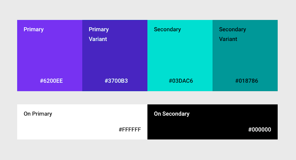
Material Design v2 (2018) semantic colors:
- Primary
- PrimaryVariant
- OnPrimary
- Secondary
- SecondaryVariant
- OnSecondary
- Surface
- OnSurface
- Background
- OnBackground
- Error
- OnError
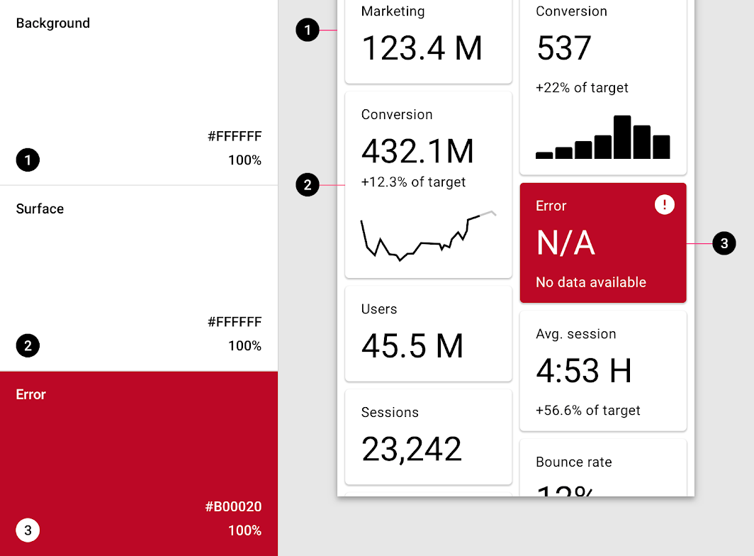
Primary was meant to be the most frequently used on components. Secondary acted like an accent that's sparingly used on components like FAB, switches, & links. Then there's the On[Primary/Secondary] for colors that are placed on others, think text. Here's an illustration of that in action:
Surface & Background at first sound synonymous, however here's an image illustrating the difference:
Material Design v3(2021) semantic colors:
- Primary
- On Primary
- Primary Container
- On Primary Container
- Secondary
- On Secondary
- Secondary Container
- On Secondary Container
- Tertiary (third in order)
- On Tertiary
- Tertiary Container
- On Tertiary Container
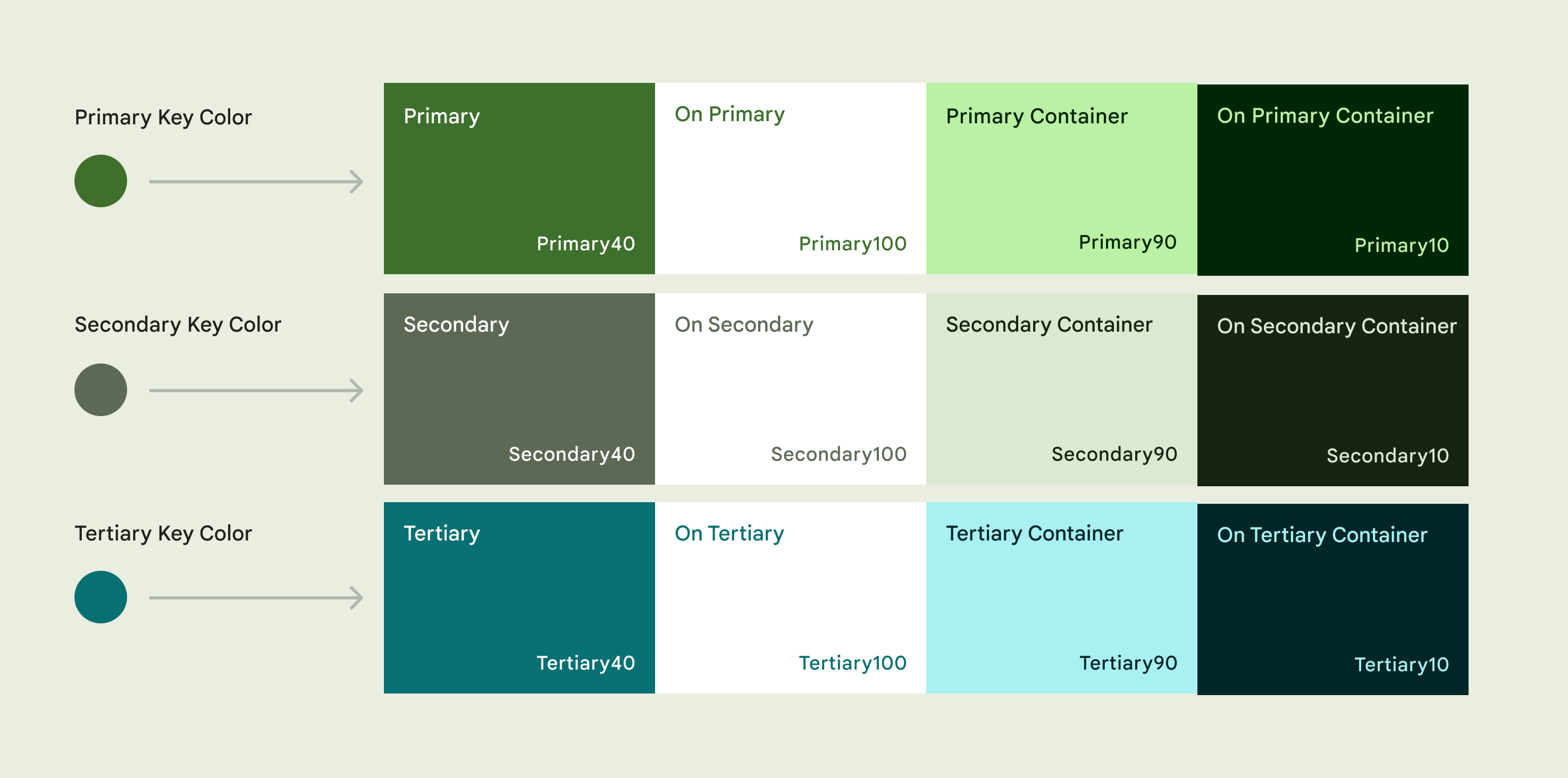
Primary: "key components across the UI, such as the FAB, prominent buttons, active states, as well as the tint of elevated surfaces."[4]
Secondary: "less prominent components in the UI such as filter chips, while expanding the opportunity for color expression."[4]
Tertiary: "contrasting accents that can be used to balance primary and secondary colors or bring heightened attention to an element. The tertiary color role is left for teams to use at their discretion and is intended to support broader color expression in products."[4]
Themes for Material Design v3 has a whole lot more to it. The take away is defining semantic colors for a theming framework is not easy. Even Google is still tackling the problem one iteration at a time. Let's take a look at iOS.
iOS 📱
When picking up iOS a few years back and wanting to create a theme, I found articles suggesting creation of one's own theming engine. After building one that matched Android's at the time, found a library that could have saved me time, I nonetheless was shocked. iOS, per my expectations was surely ahead in the theming race against Android.
Dark mode however was later introduced in iOS 13. What's interesting about its approach is that iOS didn't necessarily allow for developers to switch between N number of themes, instead focused on supporting the 80% use case: 1 main theme & its dark mode counterpart.
iOS 13(2019) semantic colors:
- Label
- Secondary Label
- Tertiary Label
- Quaternary Label
- System Fill
- Secondary System Fill
- Tertiary System Fill
- Quaternary System Fill
- System Background
- Secondary System Grouped Background
- Tertiary System Grouped Background
- Separator
- Opaque separator
- Link
- Dark Text
- Light Text
- Placeholder Text
For each of these semantic colors you may define a dark mode variant. As you may have noticed, iOS's framework is rather lightweight and not as opinionated as Android's.
Now that we have a rudimentary understanding of native mobile framework landscape, let us reevaluate the options we have in harmonizing them.
Solution #1: Create frameworks copying another
This option is for example to create a custom framework on iOS or Android that follows its counterpart. For example, create an iOS theming engine that follows Android's way of defining semantic colors.
Pro's:
- Leverages existing framework's work in defining semantic coloring.
- One codebase uses its native theming framework.
Cons:
- Cost of creating a custom framework.
- Cost of keeping that custom framework up to date to its inspirational framework source as changes are introduced.
Because Android's framework is more thought out, allowing designs to be more expressive, I would opt to create an iOS theming framework that follows Android's. I have done this for iOS where it copied Material V1 and found the results to be decent:
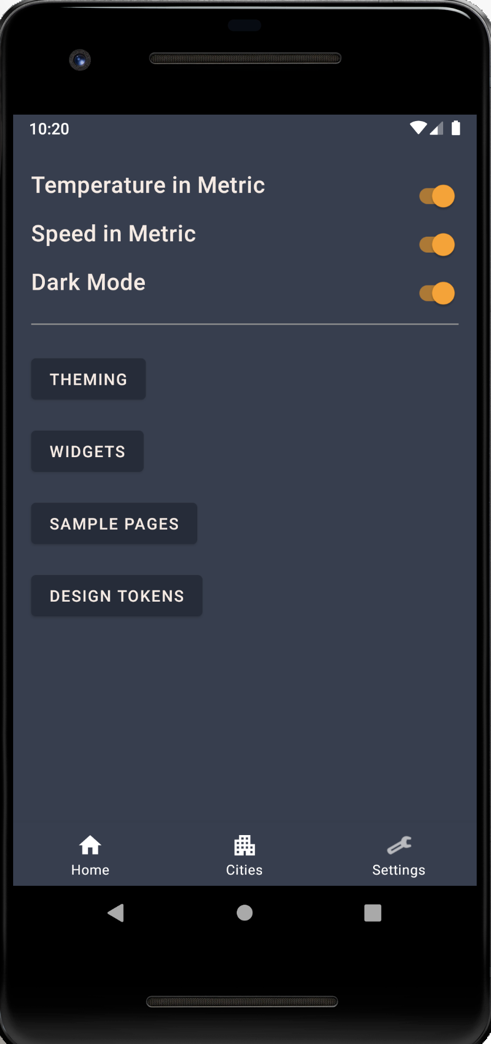
Android (using native framework):
iOS (using custom Android inspired framework):
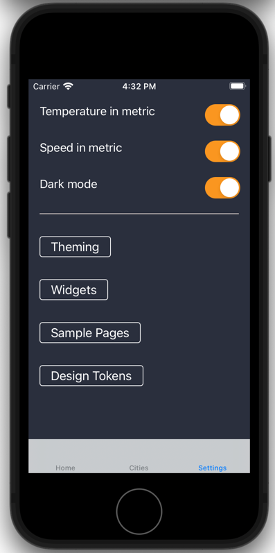
All of the components above were automatically applied their colors per rules defined matching Material. Here's how switches' colors were mapped to a theme for example:
UISwitch.appearance().onTintColor = currentTheme.accentColor
The Android's Material v1 theming framework code for iOS used above can be found here.
Solution #2: Custom frameworks for all
Perhaps Material's theming framework is too much and iOS's is too little. Perhaps you & your design team have a more thought out theming system in mind and you decide to go with it.
Pro's:
- Complete control over theming system from design to implementation for all platforms.
- No need to adjust to native theming framework changes (as seen with Material).
- Defined once, may be reused across a number of projects & their design systems.
- Design theme definition are easily consumed by all platforms.
Cons:
- Difficulty in defining a theming system.
- Costly upfront research & development, as it will need various iterations to get right.
- Maintenance is needed long term in implementation for platform updates (i.e. addition of components).
- Not following an industry standard brings forth learning curves for newer team members.
- Loss of native platform perks (see Material v3's Dynamic Coloring).
This approach comes off to me as the most straight forward as well as most gutsy approach. You want an agnostic framework theming definition? Go for it. Platforms don't follow its definition natively? Build custom abiding frameworks.
While development seems to be most costly in this equation, I truly believe the definition of a theme that is all platform encompassing is going to be the cost culprit. The reason being, application design changes. Different trends come and go with how applications ought to look and feel. Material design v1-3 might as well have been called differently at each version given how different they looked from one another. The more expressive you want your application to be, with various sub looks and feels, the more definition you need to add to your theme definition. Lastly, different platforms have different needs from a theme definition, Web for example has hover states for components, whereas mobile does not.
Solution #3: Use native frameworks
Last but not least, the de-facto approach today: design a platform agnostic theme definition, where platform code owners handle translation & implementation to their native framework.
Pro's:
- No need for developing a custom theming framework.
- Availability of native framework perks.
Cons:
- Difficulty of theme definition consumption by all platforms.
- Risk of developers not utilizing theming framework, thereby accruing dark mode tech-debt.
The ideal scenario is to have everyone using their native framework. For that to happen however a platform agnostic theme definition needs to be placed, as well as translated versions of it per each framework. There's an investment needing to be placed to make a playbook allowing it to be reproduced time & time again.
That wraps up my food for thought on the problem. We showed how dark mode is on the rise pushing the need for themes defined for apps today at a design system level. We explored how Android & iOS frameworks define themes. Lastly, the various approaches we can take to define themes for each platform consume them easily. If you have tips and insights on the subject matter do email me, or discuss on HackerNews.
Sources:
- "We asked, you told us: Just about everyone uses dark mode" https://www.androidauthority.com/dark-mode-poll-results-1090716/, AndroidAuthority.com, March 7, 2020
- Steiner, Thomas. "Let there be darkness! 🌚 Maybe…", https://medium.com/dev-channel/let-there-be-darkness-maybe-9facd9c3023d, Apr 4, 2019.
- Juwamoto, Sho, "Conference Kickoff" at "Schema" Figma conference, Oct 7 2021.
- Material Design 3. "Key colors & tunes" https://m3.material.io/styles/color/the-color-system/key-colors-tones