iOS & Android Design Tokens Best Practices
Better practices in defining design tokens: values ought to stand out from one another.
The common thread of the most impactful digital products today is the design system; a common language for designers and developers to speak that guides the creation of a product, and facilitates the best possible experience for customers. That all starts, though, with design review meetings, which tend to be the most dreaded meetings amongst developers and designers, as well as their most frequented place of contact.
“This needs more padding.” “That isn’t the same blue as on the mockup.” A meeting where one wonders why the other can’t clearly see what they’ve being coding for the past few weeks, and the other wonders if they’ll ever be freed of the other’s pixel chasing dreams.
It’s a mind numbing meeting for all parties involved. The reason is obvious: it’s a game of spot the difference tasked by grown adults. A game even elementary students find boring eventually, yet routinely done by professionals seriously.
Has our industry grown complacent to this game? Is it even seen as a problem worth eliminating in the first place?
Being in an industry that’s notorious for automating others’ processes, it’s about time we looked internally and automated one of our own. In this article I’m going to help you do just that for your design and engineering teams by introducing the power of a design system, brought to life by the concept of design tokens, better practices, and how to best communicate them across the board.
I’m then handing you two free projects for both Android and iOS that will help jump start your process in having your developers and designers thank you for the extra time they now have to play Pictionary post sprint reviews.
Design tokens
In trying to explain what a design token is, it’d help define what its parent system, a design system, is first. I liked this definition by Grinaker:
“A design system maintains the visual and functional elements of an organization in one place, in order to fulfill its brand principles through design, realization, and development of products and services.”[1]
When it comes to mobile development, a design system encompasses all building blocks used, how they behave, when to use them, as well as all quantitive values used to describe pages visually. These visual, quantitive values can be categorized as design tokens. Think of these values as those used by designers in mockups that are then absorbed and used by developers in application development. These values include, but are not limited to: paddings, margins, text sizes, and color values.
The value in defining design tokens
Universal team language
Imagine a designer mocks up a mobile page with a margin of 4px (pixels) between two buttons. An Android developer then in implementing the mockup, has the margin as 4dps (density-independent pixels), as it’s Android’s standard unit of measurement for spacing.
In reviewing the page on a testing device, the designer measures the margin size in actuality being 6px. The designer points out the mismatch to the developer, who then show it’s accurately 4px on a differing testing device.
What gives?
DPs scale in pixels according to the phone at hand’s screen size & resolution. iOS similarly use Points that too scale similarly between different iPhones & iPads.
Miscommunication is far too often responsible for defects. A clear design language goes a long way to reducing the risk of these types of defects.
Edward Cessna, Senior Director of Engineering, YML
The need here is clear: to instill a unified language to describe design tokens, in this case spacings, amongst all parties involved in development to avoid painstaking miscommunications from reoccurring time and time again.
The cement between building blocks
If widgets are an app’s building blocks, then design tokens is its cement that glues them together. Their usage is commonly used in application development and the implications are many should they not be well thought of nor defined.
If colors for example in an application are not defined, then developers will hardcode them impromptu as they see fit resulting in poor UX, as pages have no rhyme nor reason in color scheming. Should spacings be defined, but not as well thought of for example, an app may not be as visually pleasant from users’ standpoint.
Better practices in defining design tokens
Values ought to stand out from one another:
A common pitfall of curating design tokens is creating far too many of them that are too close in value to one another, which then makes it hard to discern when to use one over another.
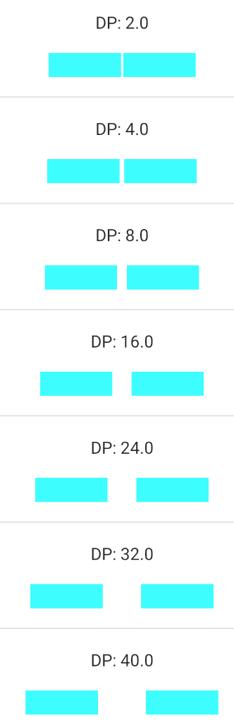
When thinking of how to cut up real estate of a mobile page, convention states to create a grid (rows & columns) where each are of size 8. Naturally when defining spacing values, first thought is to go by 8 increments, where the first few values are fractions of an 8th. Let’s see visually what the problem with that is.
Bad linear growth using f(x)=8x. Notice how hard it is to tell side by side values at 16dp onwards.
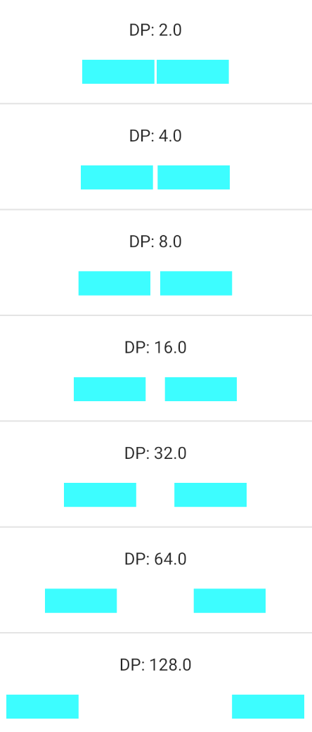
Good exponential growth using f(x)=2^x.
Notice how these values shine more.
Gotta name them all…descriptively:
Nathan Curtis, in his article “Space in Design Systems”, stated when it comes to naming design tokens one should:
“Name Each Step for Memorable, Accurate Reuse.”[2]
When it came to naming spaces, Curtis stated:
“I love Gmail’s Compact, Cozy, Comfortable space toggle. So when we built our space system, I suggested we use those labels in our work.”[2]
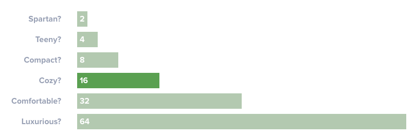
Notice how these names are relatable to the average person and how practical they can prove to be in day to day interactions: “Hey, can we change the spacing between these two buttons from Compact to Comfortable please?”
Naming schemes that are too technical or vague alternatively can be problematic.
Take for instance this scheme: single_spacing, double_spacing, triple_spacing, etc, where a spacing equates to 8dp.
Sure, one may be able to derive the actual quantity of DPs used per value, but the values themselves aren’t as memorable nor as outspoken as with the previous example. Think of also how limiting it would be to tie a name to its value. What if one were to change a value out of the many spacings, how would that be accomplished?
Find the balance between too granular and too general of values
Consider the example of spacings, which ought to have values for both vertical & horizontal use cases, and not only be generalized as spacings. The reason is, you’ll be able to easily configure your apps’ looks and feel depending on newer phone size trends.
Imagine phones got taller, but not any wider. Then simply increase your vertical spacing values, leave your horizontal values alone, and ta-da — you’re done.
Text sizes defined alone would be considered too granular. Text appearances, however, are a better generalization that include: font, text size, and attributes applied, i.e. bold, italicized. This will tremendously simplify usage, however, require more upfront planning.
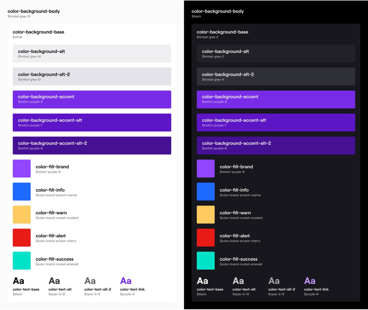
Colors directly referenced by name is not a good idea. Instead, create indirect reference of colors that allows for easier digestion:
Bad granular color naming:
Good general color naming:
Use platform specific design tokens first
Using out of the box values for your app will create more commonality with apps found on its respective platform, thereby creating more immediate familiarity with your users.
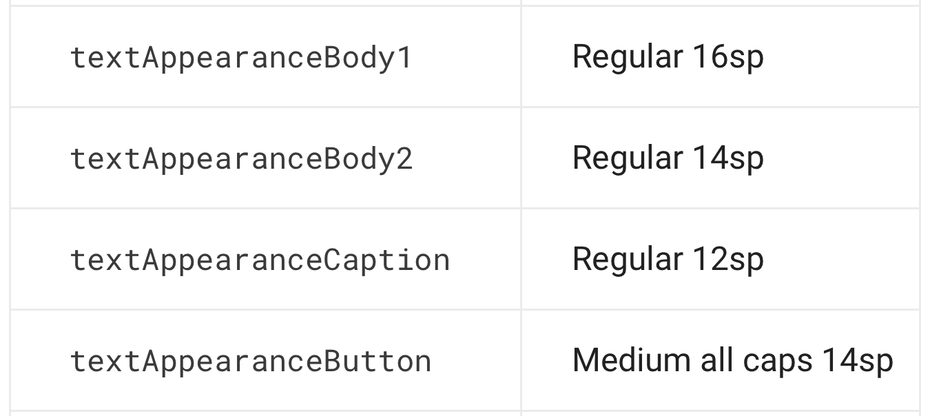
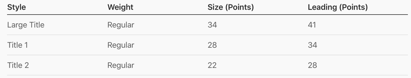
Both Android & iOS have text appearances out of the box for example:
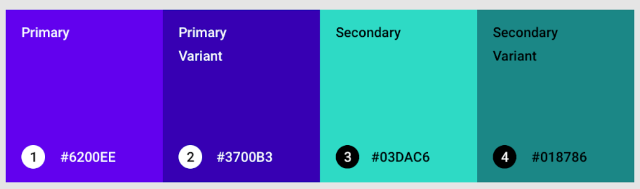
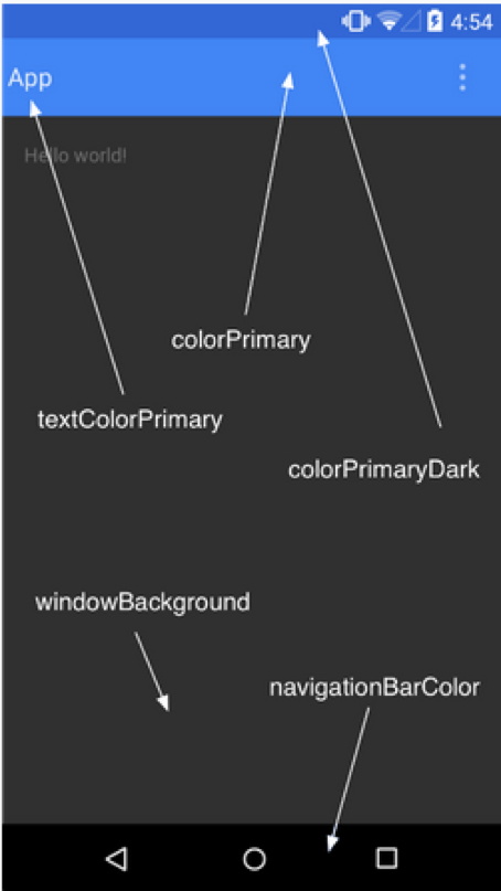
Android has a theming system that allow you to set a number of colors that are then applied to your widgets app wide:
Define values against a single device
Since design tokens display differently from phone to phone, it’s best to define values against a single phone for the optimal experience. Naturally choose the device that’s most commonly used by customers. Once customers shift usage to a more popular phone, see if your values need calibration against it. If need be, adjust accordingly and repeat.
How to best communicate design tokens
Attributes for all
When documenting your design tokens, your goal should be to make them as easy to digest by both designers and developers as possible. Whatever attributes that either side find useful ought to be noted.
For example, say your colors are well named and have their hex values defined. Designers may like to note their HSL lightness to help better tell between those grays. Although this serves no use to developers, their inclusion brings no harm, thus preferred.
Narration via visualization
An IKEA catalog is nothing without its images. Similarly, inlining displays of design tokens in action makes your document that much more compelling and outspoken.
Close to home
The further away your documentation gets from the app and those who work on it, the more likely it is to be out of sync. How much closer can the document be to the app, than to be inside the app itself?
Not much, therefore design systems that are in-app are the way to go. What do I mean by in-app? Literally embedding a page that’s accessible to designers, PM, QA, and developers within the app that’s being developed itself, however inaccessible to customers.
“Is it really worth the hassle?” you may ask yourself. Consider this: it can act as a table of contents of the app’s used values for the reader, such as a QA, who can now ensure the table matches its contents. Furthermore, it can serve as a contract amongst team members to abide by. If a design mockup uses a value outside of the table of contents, then a discussion should ensue to whether this new value belongs to the system or not.
But wait, there’s more!
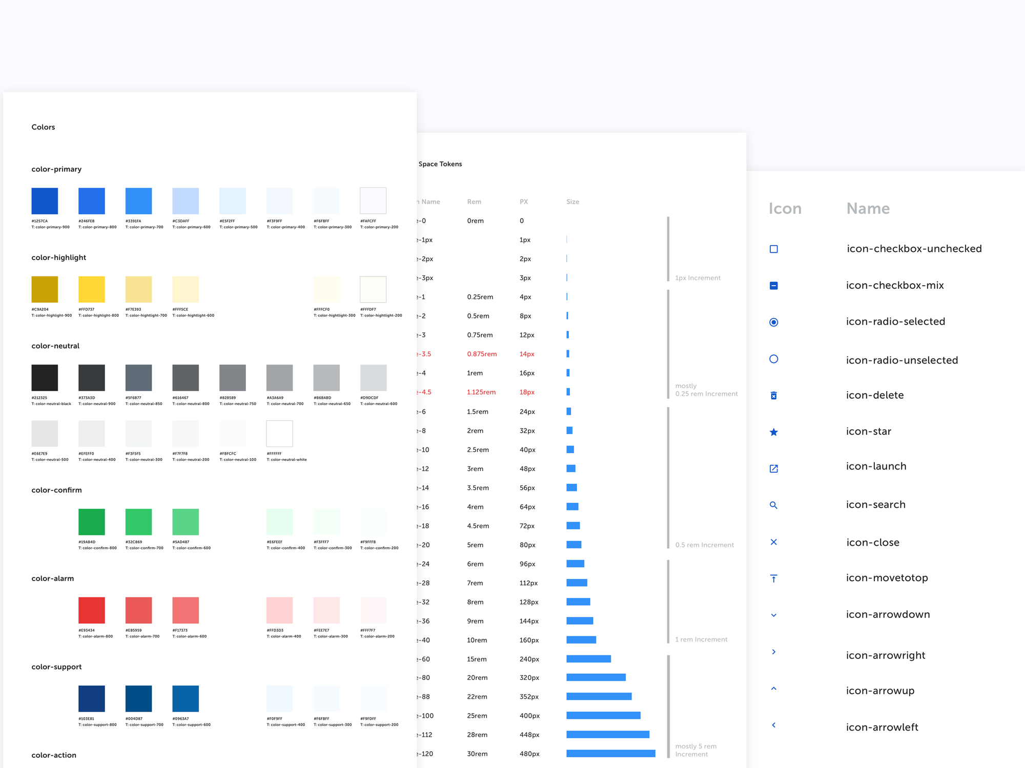
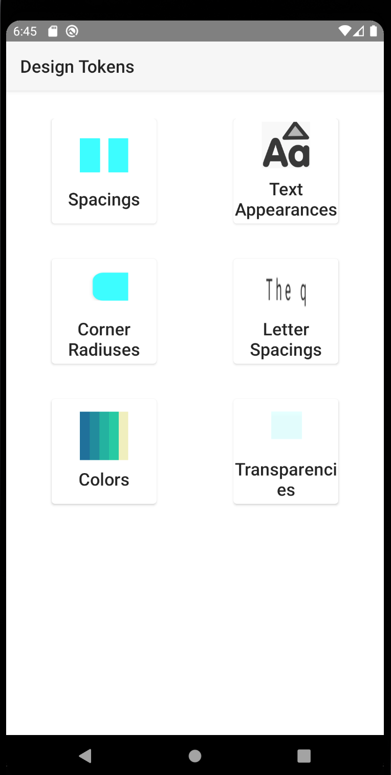
To help kick start your project’s design tokens, I’ve published a variety of values visualized for both Android & iOS! They’ve been released to the public domain making them entirely free in usage and modification.
Sources:
- Grinaker, Siw. “What is a design system?” https://enonic.com/blog/what-is-design-system. Enonic. February 13, 2019.
- Curtis, Nathan. “Space in Design Systems” https://medium.com/eightshapes-llc/space-in-design-systems-188bcbae0d62. Medium. September 25, 2016.
[This article was initially published & front paged on UX planet.]