Shows Me
Problem: Users need to visit numerous websites to compile available music events around them that are soon to take place.
Last app design iteration:
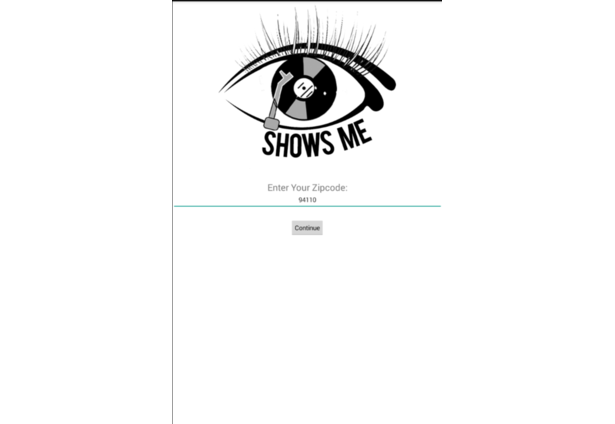
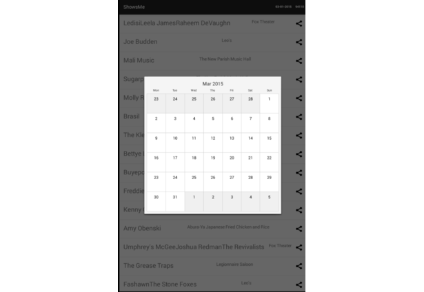
Humble beginnings from 2015 LAUNCH hackathon:
2 years later…I picked up the project once more:
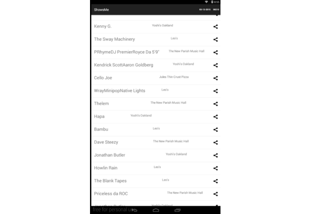
This time with a new outlook. First iteration listed musical events as well as streamed sample music by events' performing artists. I removed the exploratory streaming aspect of the app, and instead focused on event listing & helping the user get to an event.
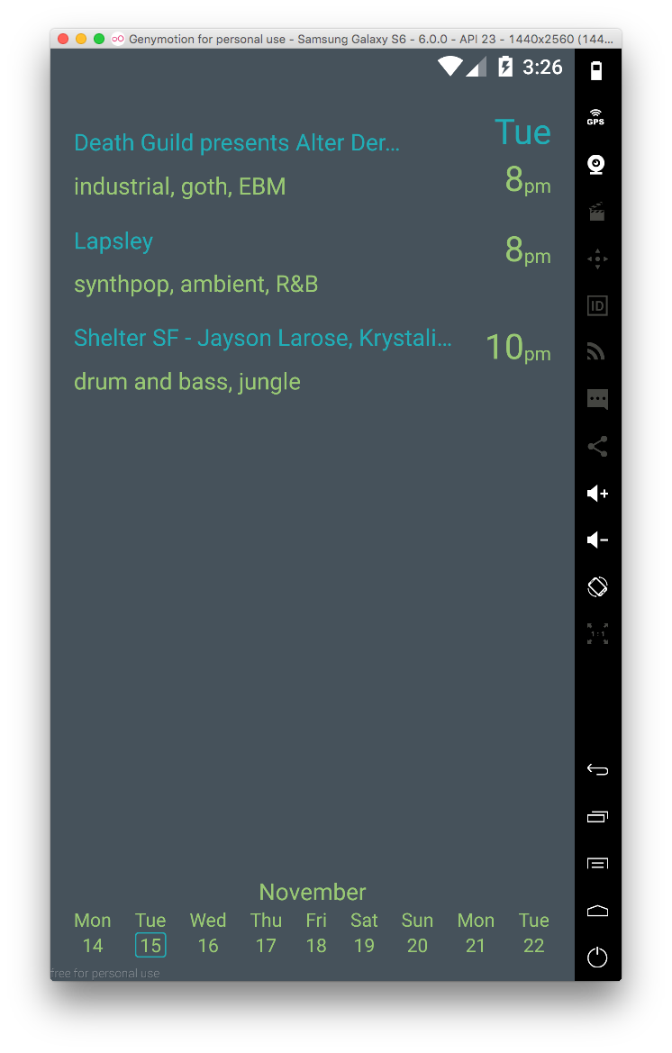
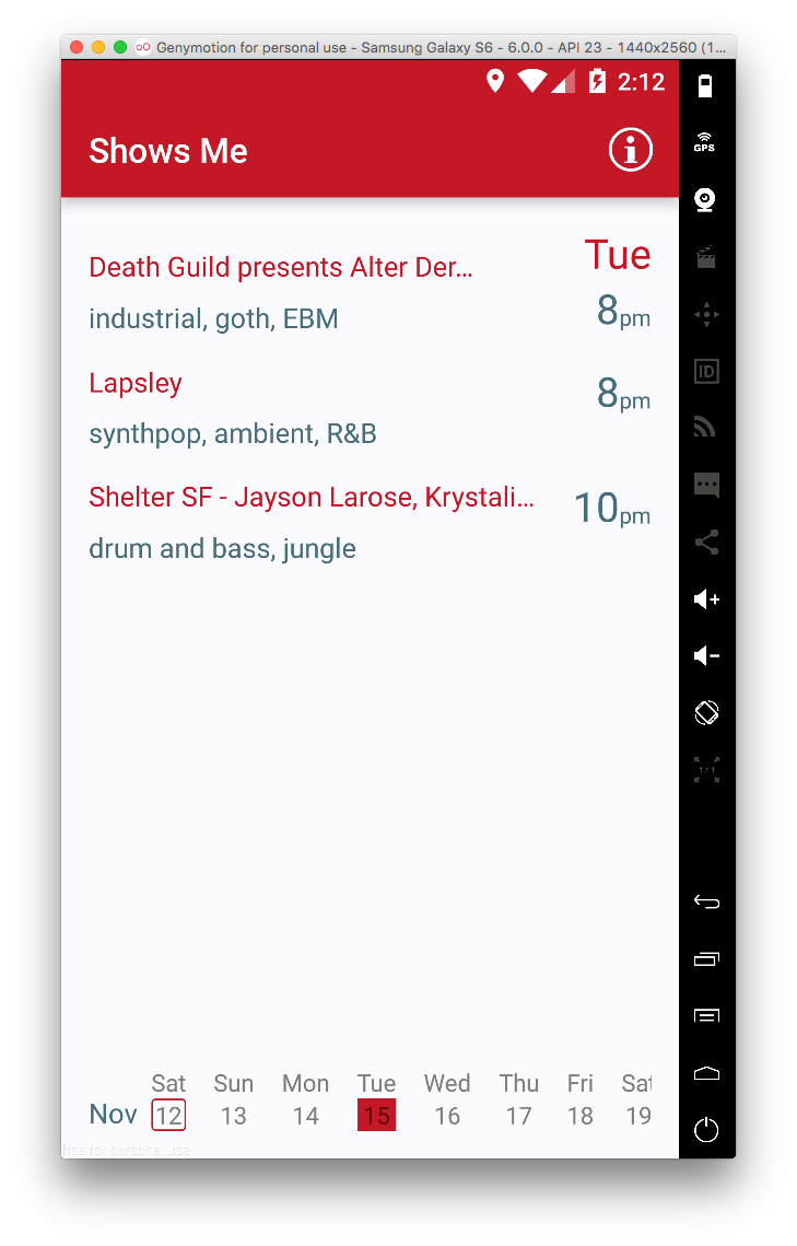
V1:
- Broke up events by this week vs next week. This was to eliminate the need for a date selector, while addressing the app’s main use case: “What’s going on this weekend?”
Issues with V1:
- When does a week really end & begin?
- What if the user wants to see on-going events that started last week?
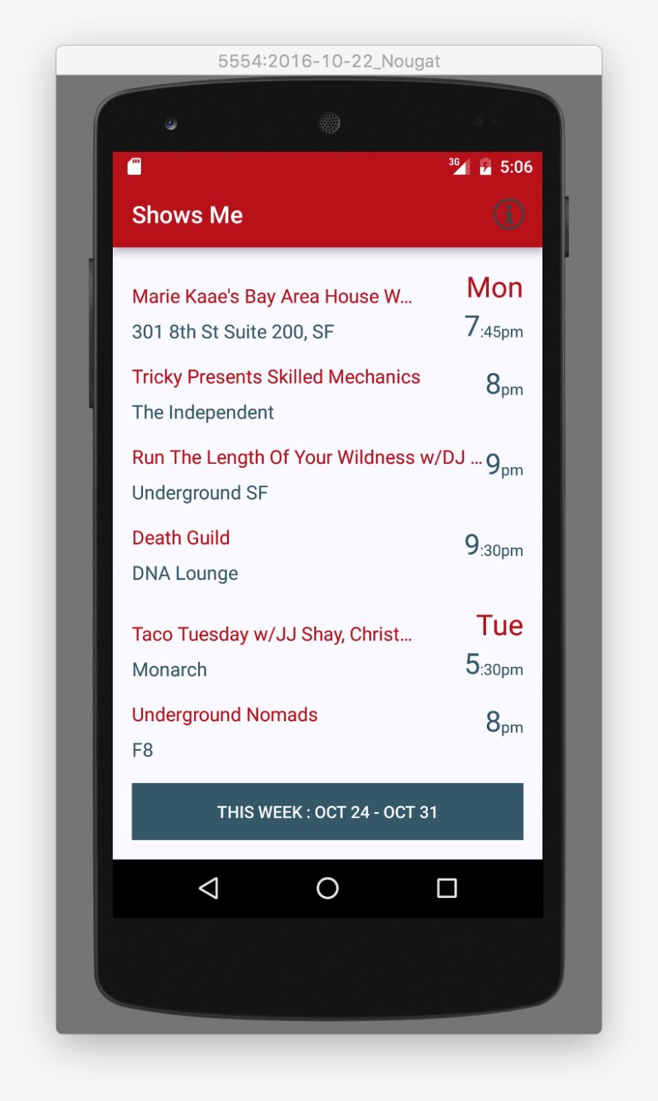
V2 changes:
- I revised my initial approach to allow for individual date selection.
Issues with V2:
- Current month isn’t shown.
- Today’s date isn’t shown.
- The |
>|icon is hard to tap.
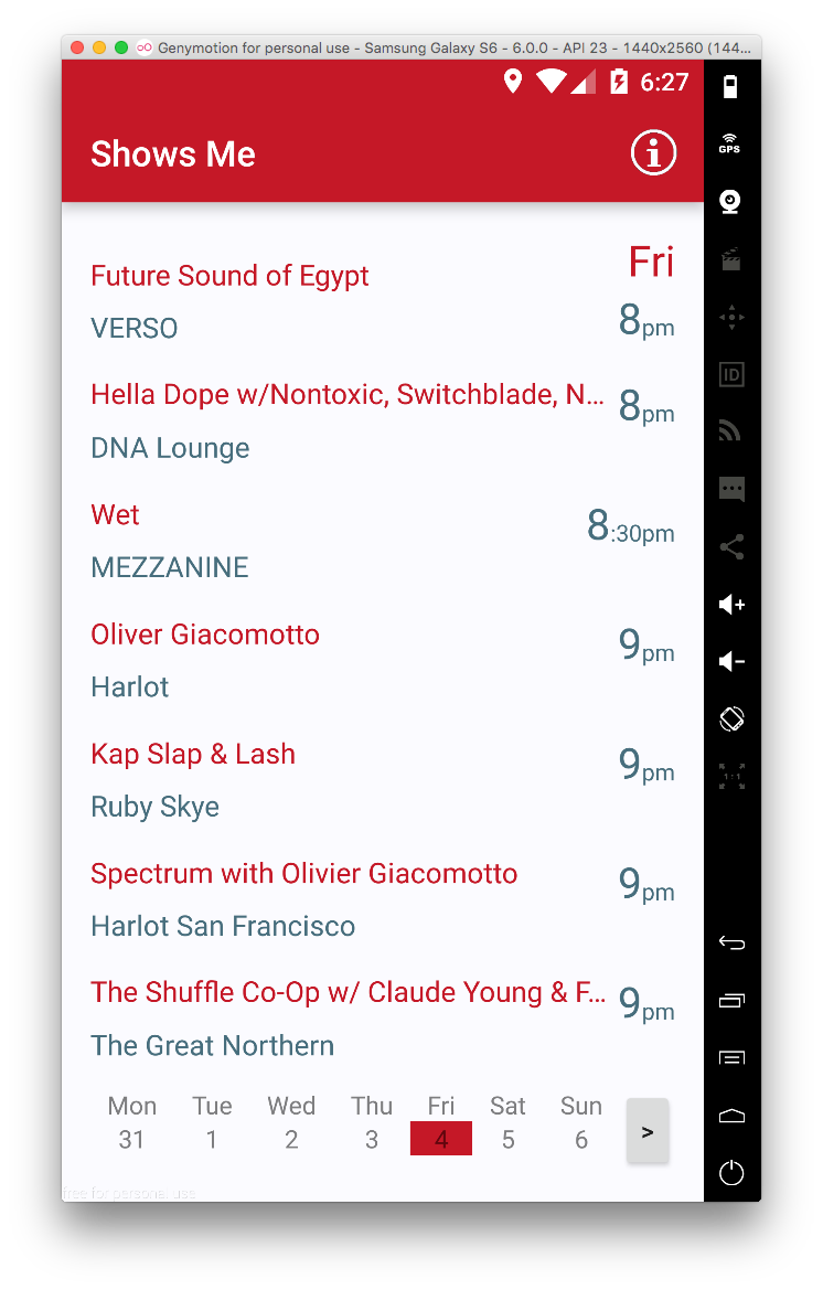
V3 changes:
- Indicator for today’s date added.
- Short hand month added.
- Scrolling for dates added.
Issues with V3:
- What’s the toolbar for again?
- If someone is at an event & wants to share location, do they really want their phone bright white?
V4 changes:
- Removed toolbar.
- Gave more room for date selection.
- Gave more room for month label.

Issues with V4:
- Sure the dates scroll, but they still require tapping. It would be nice to able to scroll through dates by tapping down while moving horizontally through dates.
- In scrolling through events for a particular day and reaching the end, could in turn start listing the following date’s events, and while doing so, simultaneously moving the current selected date indicator accordingly.
- The genres aren’t clear subtitles. Could use a smaller font with an accenting background color.
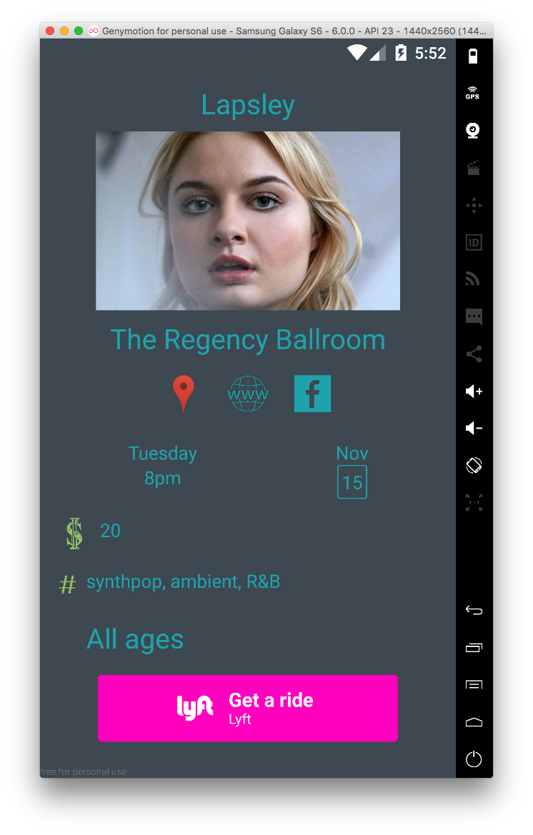
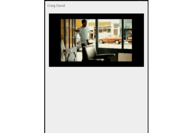
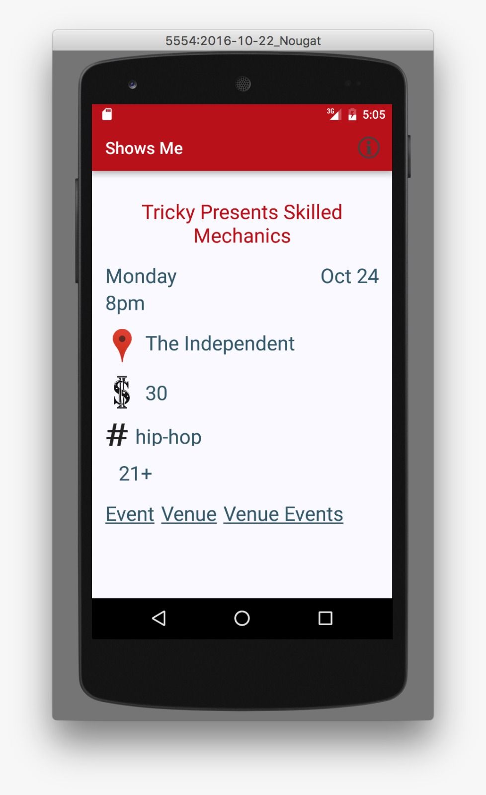
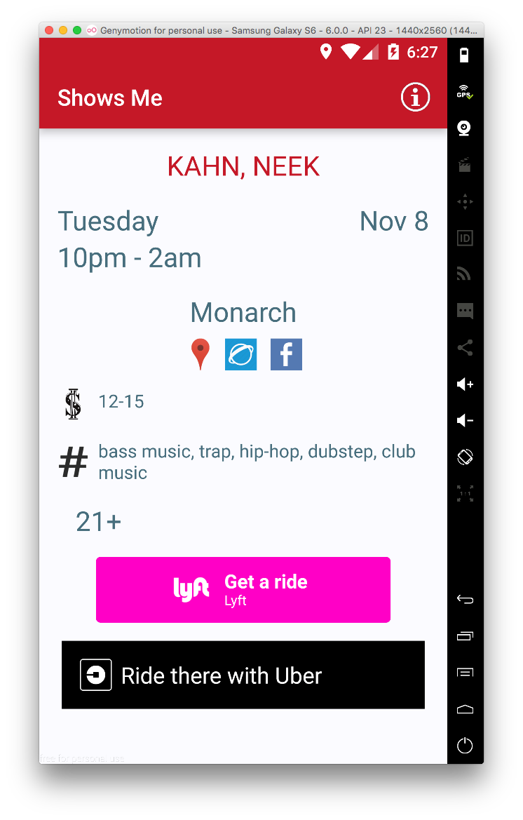
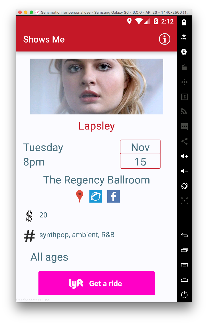
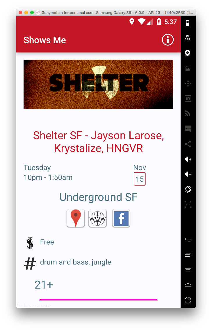
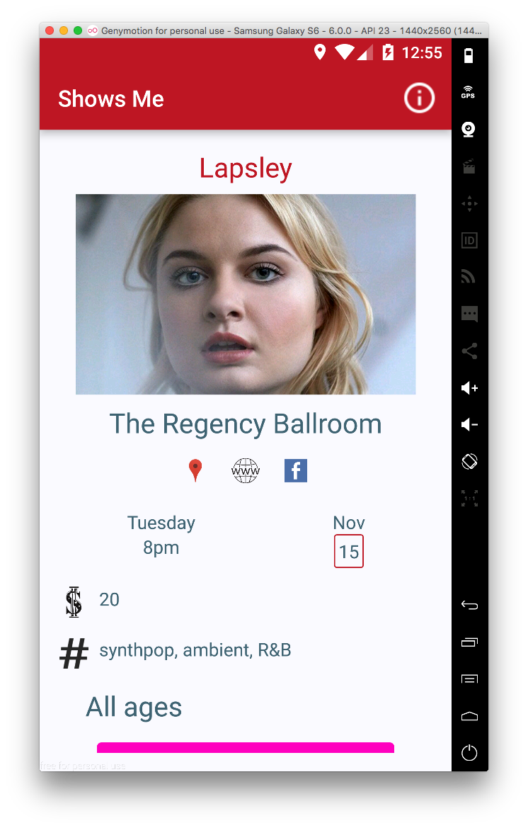
Now for the event page’s iterations:

While the project only beta'd amongst select users, I enjoyed the UX lessons learned from each iteration's feedback loop.